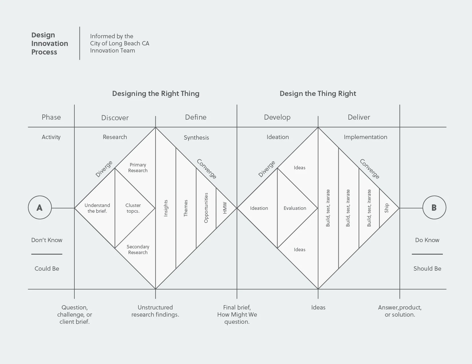
There are literally hundreds of "double diamond" design process models – many ascribe the original model to the British Design Council, but the model is so ubiquitous today it's almost impossible to find any two that are the same.
This model however, is the best I've seen. Created by my friends on the Long Beach Innovation Team, it was inspired by other existing models, but some of the language was tailored to be relevant in their specific context of city government. Visually representing the design process is a super helpful way to communicate what design looks like in organizations that traditionally are not familiar with the processes. Additionally, it gives non-designers the opportunity to connect design vocabulary to a process that they can clearly understand. As design and innovation is often ambiguous and non-linear, this approach is very helpful.
